Archive for the ‘LaTeX’ Category.

PGF and TikZ — Wow!

Mikkel and I have been working on a poster for the Summer School in Game Theory next week. For a poster you obviously need some graphics, and at first we started out with using PSTricks. That worked quite well and I was surpriced how easy it was to generate good pictures.

But PSTricks doesn’t work in pdfLaTeX, and for some reason the PostScript output didn’t work as well for me as PDF output. I then found the amazing PGF and TikZ packages with which you can make beautiful graphics for both PostScript and PDF output. The TikZ syntax is very clever and easy on the eyes, it’s inspired by PSTricks and MetaPost, another favorite program of mine.

With TikZ you get a very nice highlevel programming language for producing graphics in (La)TeX. For example, this code (taken roughly from the frontpage of the PGF and TikZ manual):

\tikzstyle{level 1}=[sibling angle=120]
\tikzstyle{level 2}=[sibling angle=60]
\tikzstyle{level 3}=[sibling angle=30]
\tikzstyle{every node}=[fill]
\tikzstyle{edge from parent}=[snake=expanding waves, segment length=1mm, segment angle=10,draw]

\tikz [grow cyclic, shape=circle, thick, level distance=10mm, cap=round]
\node {} child [color=\A] foreach \A in {red,green,blue}
      { node {} child [color=\A!50!\B] foreach \B in {red,green,blue}
        { node {} child [color=\A!50!\B!50!\C] foreach \C in {black,gray,white}
          { node {} }
        }

gives you this:

Art by TikZ

and this little piece of code:

\begin{tikzpicture}[line width=3pt]
  \draw[->] ( 0,-1) — ( 0,20) node[above] {Expenses};
  \draw[->] (-1, 0) — (20, 0) node[below] {Income};

  \draw[->, >=latex, blue!20!white, line width=72pt]
    (4, 16) — node [black,sloped] {Optimization} +(-45:17cm);

  \draw[draw=blue, loosely dashed]
    (1.5,1.5) coordinate (C1) node[below=3pt]       {$C_1$} –
    (10, 3)   coordinate (C2) node[below=3pt]       {$C_2$} –
    (13.5, 5) coordinate (C3) node[below right=3pt] {$C_3$} –
    (17, 10)  coordinate (C4) node[right=3pt]       {$C_4$} –
    (19, 18)  coordinate (C5) node[right=3pt]       {$C_5$};

  \fill (C1) circle (5pt) (C2) circle (5pt) (C3) circle (5pt)
    (C4) circle (5pt) (C5) circle (5pt);

  \path (9,16) coordinate (C0);

  \path (intersection of C3–C4 and C0– 19,6) coordinate (opt);
  \draw[|->, red, shorten >= 5pt] (C0) — (opt);

  \filldraw[red] (C0) node[above left] {$C_0$}
    (opt) node[below right, text width=4.5cm] {Optimization Target} circle (5pt);

\end{tikzpicture}

gives you this graphic, which we used for our poster:

Benchmarking example made with TikZ

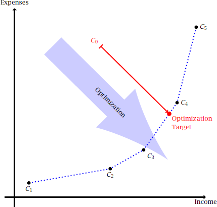
The graphic illustrates how company C0 ought to be more efficient by reaching the optimization target indicated. Notice how the target is found automatically as the intersection between the line segment from C3 to C4 and the line going downwards in a -45° angle from C0. Features like that used to belong only to MetaPost. Please also note now the color of the big arrow is specified as 20% blue mixed with 80% white. This easy and powerful way of selecting colors is possible thanks to the xxcolor package.

So if you’re into [LaTeX][] and need to include graphics in your documents, then look into PGF and TikZ. The installation is extremely easy: simply unpack the tarball and move some directories into your ~/texmf directory.

The LaTeX Font Catalogue

It’s a common misunderstanding that when you typeset something with [LaTeX][], then you have to use the Computer Modern typeface, a beautiful font covering tons of characters designed by Donald E. Knuth.

Okay, that’s probably not entirely true — you might know that \usepackage{pxfonts} will give you Palatino (Garamond) instead, or that \usepackage{times} does the same for the insanely popular Times New Roman.

But did you know that there’s many more available? Palle Jørgensen from the Danish TeX User Group has made a cool site called the LaTeX Font Catalogue where you can check no less than 94 freely available fonts for use with TeX and LaTeX!

A whopping 21 comes with support for typesetting math. Most fonts simply have the characters needed to typeset letters and numbers plus the common pecial characters, but some fonts also have the glyphs needed for stuff line integrals, arrows, greek letters, etc. Using two different fonts (one for the body text and one for the math) is normally a bad idea because the fonts might have different weights (different blackness) and different height. Still, people often mix, say, Helvetica (a sans serif font!) with Computer Modern (a very “seriffed” font!)… it do that, it looks icky.

Here’s an example of some math typesat with a font called Kurier Light Condensed:

Biot-Savarts Law typesat with Kurier Light Condensed

Even though I’ve used LaTeX for years now, and I’ve been interested in typography for some time, I was surpriced to see so many free fonts available for LaTeX. The problem is actually not the availability of fonts — I guess that most of us have a couple of hundred TrueType fonts on some CD somewhere, and TrueType fonts can be used with a modern version of (pdf)LaTeX. The problem is just that using an arbitrary TrueType font involves some converting and some configuring — it needs the right infrastructure.

But for those 94 fonts this has already been done by the nice people who make the TeX Live LaTeX distribution. I’m currently using the default LaTeX that comes with [Debian][], namely teTeX and it has always worked great for me. But now I’m looking forward to seeing TeX Live in Debian — the packages have now entered experimental, and that’s an important step on the way to be included with Etch, the next stable version of Debian.

Browsing through old memories

I was browsing through my old reports from way back in primary and high-school. That brought back some memories… I found lots of short stories from my Danish and English classes — it’s very cute to see a two-page summary of some English text which I now don’t even remember reading :-)

There were also bigger reports among my old stuff: a report from a class excursion to Nordjyllandsværket, our local power plant in Aalborg. Our class also made an excursion to Dansk Eternit where we made tests with breaking their fibre-cement roof elements. I might put those online someday if I can get them converted.

The reports and texts from my primary school days were all written in Microsoft Word — I had not yet seen [the light][LaTeX] back then… :-) During high-school I started using [LaTeX][], and now I’m glad I did: the DVI files still exactly like they did those five years ago!

With the Word files things are a bit more difficult: OpenOffice is able to open them all without problem and the text is there with the correct formatting. The embedded images are also there and OLE stuff like Equation Editor objects and vector drawings from the venerable CorelDRAW are generally there too, although some of them looked a little weird.

There’s also the problem that I no longer have programs like CorelDRAW, so I’m no longer able to edit those images — I have basically reached a dead-end in the upgrade path when I switched to Linux. With programs like MetaPost I don’t have to be afraid of that — it’s free so I’ll have access to MetaPost today, tomorrow and in ten years.

If you’re a normal Windows user, then you might be thinking something along the lines of “What about incompatibilities between new and old versions?” Fear not! Stability is a major concern for people in the LaTeX world (and MetaPost is primarily used with LaTeX). I believe this is so because LaTeX is a tool used for serious stuff where one would actually loose huge amounts of money if something “suddenly” changes. A twenty page document written in Word doesn’t count at serious stuff — a 1000 page book in LaTeX does.

There you want to be absolutely certain that everything looks the same as the first edition when you begin preparing a second edition. So TeX itself is now frozen and all changes to LaTeX are made with much care so as to not disturb existing documents.

Despite the grieves over MS Word it was an enjoyable tour through the good old days!

Please don’t do that…

Browsing the access logs of my site is always fun — you never know what you’re gonna find! For example, it appears that people come to my site looking for information about the Microsoft formula (equation) editor.

LaTeX example

How strange, for I haven’t been using this clumsy thing in at least 7 years! These days I wouldn’t consider using anything but [LaTeX][] which gives you vastly superious results when typesetting complex formulae.

The example on the right is taken from my old school paper on Mersenne Primes (in Danish), and it shows that if 2p − 1 is a prime, then p must be a prime too, for if p = rs then we have just seen that 2s − 1 divides 2p − 1! Before you ask or look in the source of this page… the inline math was done by hand using ordinary [XHTML][] entities and tags. No fancy [MathML][] markup here! It’s not that I don’t want to, I just haven’t looked that much at MathML yet.

The DFSG vs the LPPL

I just saw this huge discussion over at the Debian-devel mailinglist about whether or not the LPPL (LaTeX Project Public License) is a free license. That is free in the Debian sense: it has be fulfill the DFSG (Debian Free Software Guidelines) before it can be included in the main section of the Debian archives. There’s currently lots of stuff in the archive that’s licensed under the LPPL, but the Debian guys would rather see that it was distributed under another license, or that the LPPL is changed to conform with the DFSG.

The problem seams to be, that the LPPL forbids you from modifying a file and then redistributing it using the same filename. This is important for us LaTeX folks, because one of the promises of LaTeX (and TeX) is, that a document processed today will look identical when it’s processed 10 years from now. If everybody is allowed to change important files, then that promise would be hard to keep. This isn’t just a theoretical concern — it has happened that someone changed the Computer Modern fonts made by Donald E. Knuth and distributed them as the original set. They thought that they were helping people by improving the fonts, but that wasn’t how others looked at it. I don’t know exactly what the problem was, but if they had changed the width of a character just a little, then it could mean that lines would be broken differently, something that must not happen. If an author has prepared a document using his own installation of LaTeX, then he has to be absolutely sure that the publishers version of LaTeX will place the letters at the exact same position on the page.

One the other hand, then the Debian guys want to reserver the right to change the files in their LaTeX distribution, in case they discover a security risk or something like that. This is a very hypothetical situation, but they want the right to do this anyway.

So, is boils down to a question of trust: do the LaTeX community trust the users not to cause havoc by distributing modified files from the core of TeX and LaTeX? Apparently not, and after the story about the improved CM fonts, I can understand their fear. I don’t think they fear that the teTeX maintainers would go crazy, it’s more about the principle that people has the option of changing those files.

I hope that they can works things out — it would be a real shame if this “battle of principles” should end with moving the teTeX packages to non-free, as almost everybody recognizes that TeX and LaTeX are some of the finest examples of free software.